Color
Color plays a crucial role in UI/UX design—it enhances mood, draws attention, and impacts the overall user experience.
Color Theory
It is the study of how colors interact and the effects they create when combined. Parts of color theory are as follows:
- Color harmony: The use of colors in a way that creates a visually pleasing and balanced composition.
- Color value: Refers to the relative lightness, darkness, saturation and hue.
- Color Temperature: It is used to describe how cool or warm the color is. Warm colors (such as red, orange, yellow) are associated with feelings of warmth, excitement and energy. Cool colors (like blue, green, and purple) are often linked to feelings of calm, relaxation, and serenity.
Contrast
It refers to the difference in luminance or color that makes an object distinguishable from others. Good contrast improves readability and ensures that key elements stand out.
-
WCAG Guidelines for Accessibility:
• For normal text, aim for a contrast ratio of 4.5:1.
• For large text (24px+), a contrast ratio of 3:1 is acceptable.
• Tools like Contrast Checker (WebAIM) can help ensure your design meets accessibility standards.
60-30-10 Rule
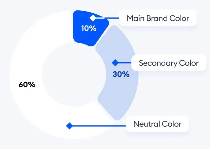
Breakdown:
- 60%: Dominant Color – this will be the main color of your interface (e.g., background or large sections).
- 30%: Secondary Color – used to add contrast to the dominant color (e.g., sidebars, cards, buttons).
- 10%: Accent Color – used sparingly to highlight important actions (e.g., CTA buttons, icons, links).
Example:
- 60%: A soft neutral or light blue background.
- 30%: A deeper blue for headers or key areas.
- 10%: A bright orange for action buttons or important elements.
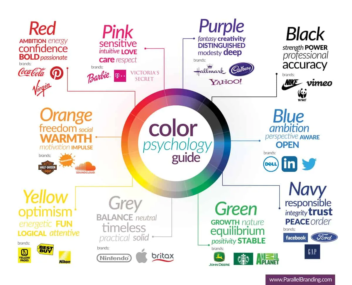
Color Psychology
- Red: Energy, passion, urgency. Use for warning messages or CTAs that need attention.
- Blue: Trust, security, calm. Often used in tech, banking, and healthcare industries.
- Yellow: Optimism, happiness, attention-grabbing. Be careful not to overuse as it can cause eye strain.
- Green: Growth, health, peace. Frequently used for environmental and finance websites.
- Black: Sophistication, luxury, authority. Ideal for premium brands or minimalist designs.
- White: Purity, simplicity, cleanliness. Common in modern, clean web designs, often as a background.
Tip: Ensure your color choice aligns with your brand’s values and the emotions you want to evoke in your users.
The Problem with Too Many Colors
- Overwhelming the User: Using too many colors can make a design feel cluttered and chaotic. This can distract users and dilute the focus from important elements, like CTAs or navigation.
- Brand Dilution: If your design uses too many colors, your brand’s identity can get lost. Instead of users associating your brand with specific colors, they might not connect with your palette at all.
- Lack of Hierarchy: Too many colors confuse the user’s understanding of what to focus on first. Design elements should have clear hierarchy, and color plays a key role in guiding the user’s eye through the interface.
- The human brain can only process a limited amount of visual information at once. Too many colors increase cognitive load, making it difficult for users to quickly grasp what’s important or what action to take next.
- Common Mistake: Overusing the 10% Accent Color for elements like text, icons, and buttons can make your design feel chaotic, defeating the purpose of the rule.
Solution: Stick to the 60-30-10 Rule and choose your colors wisely based on brand and usability.
Tip: Use the accent color sparingly, focusing on CTAs, notifications, or elements that require immediate user attention.
Resources
- RealtimeColors - Realtime Colors preview with your chosen palette.
- UIColors - Tailwind CSS Color Generator
- Huemint - Huemint uses machine learning to generate unique color schemes for your brand.