Typography
Typeface is the design of the letters (e.g., Rethink Sans, Poppins). Font refers to a specific style or weight within that typeface (e.g., Poppins Bold 16px).
In simple terms, typeface is the family, and font is the individual member within the family.
Types of Fonts
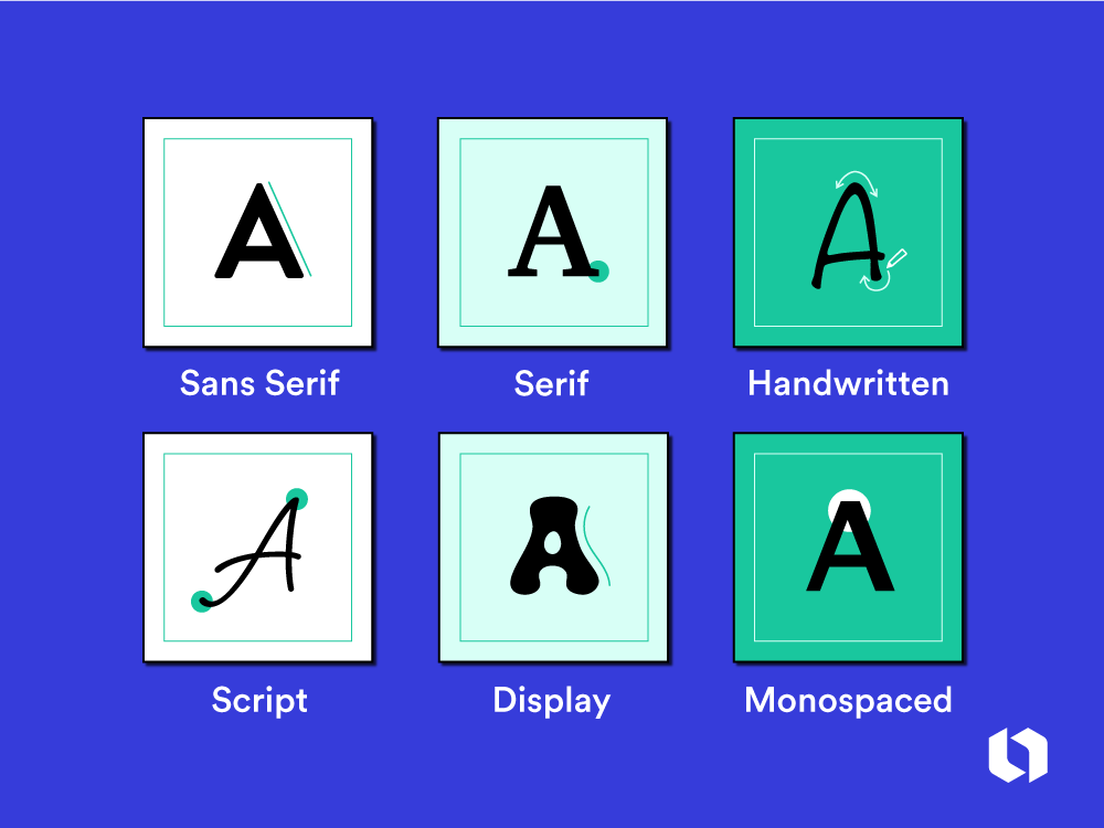
- Serif Fonts:
- Serif fonts have small lines attached to the end of strokes in letters. These fonts are seen as formal, traditional, and trustworthy.
- Examples: Times New Roman, Georgia, Merriweather.
- Use Case: Print media, high-end brands, blogs, and news websites for body text. Gives a classic, professional feel.
- Sans-Serif Fonts:
- Sans-serif fonts are clean, modern, and lack the “feet” at the end of strokes.
- Examples: Helvetica, Arial, Roboto, Open Sans.
- Use Case: Digital screens, UI interfaces, tech websites, and modern brands. Best for readability on screens.
- Script Fonts:
- Mimic handwriting or calligraphy and are decorative in nature.
- Examples: Brush Script, Lobster, Pacifico.
- Use Case: Should be used sparingly for logos or headings. Avoid for body text as they are hard to read in long form.
- Display Fonts:
- Highly decorative fonts meant for limited use, often in large sizes.
- Examples: Impact, Bebas Neue, Playfair Display.
- Use Case: Headlines, posters, banners, and branding materials where you want to grab attention.
- Monospace Fonts:
- Every letter takes up the same amount of horizontal space.
- Examples: Courier, Consolas, Source Code Pro.
- Use Case: Code snippets, terminal interfaces, or designs where a techy or vintage aesthetic is needed.
Font Weight
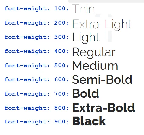
- Font weight refers to the thickness of each character in of the font.
Tip: Avoid overusing bold or italic, as too much emphasis can reduce clarity and hierarchy.
Font Size
- Hierarchy can be introduces through size. Typography hierarchy is the arrangement of text to show its importance.
- Headings (H1, H2, H3): Larger font sizes for headings, usually starting with 32-48px for H1 and scaling down.
- Body Text: 16px is the standard size for comfortable readability on most screens. For mobile, 14-16px works best.
Best Practice: Maintain proportional sizes between headings and body text to create a visual flow.
Typography Jargon:
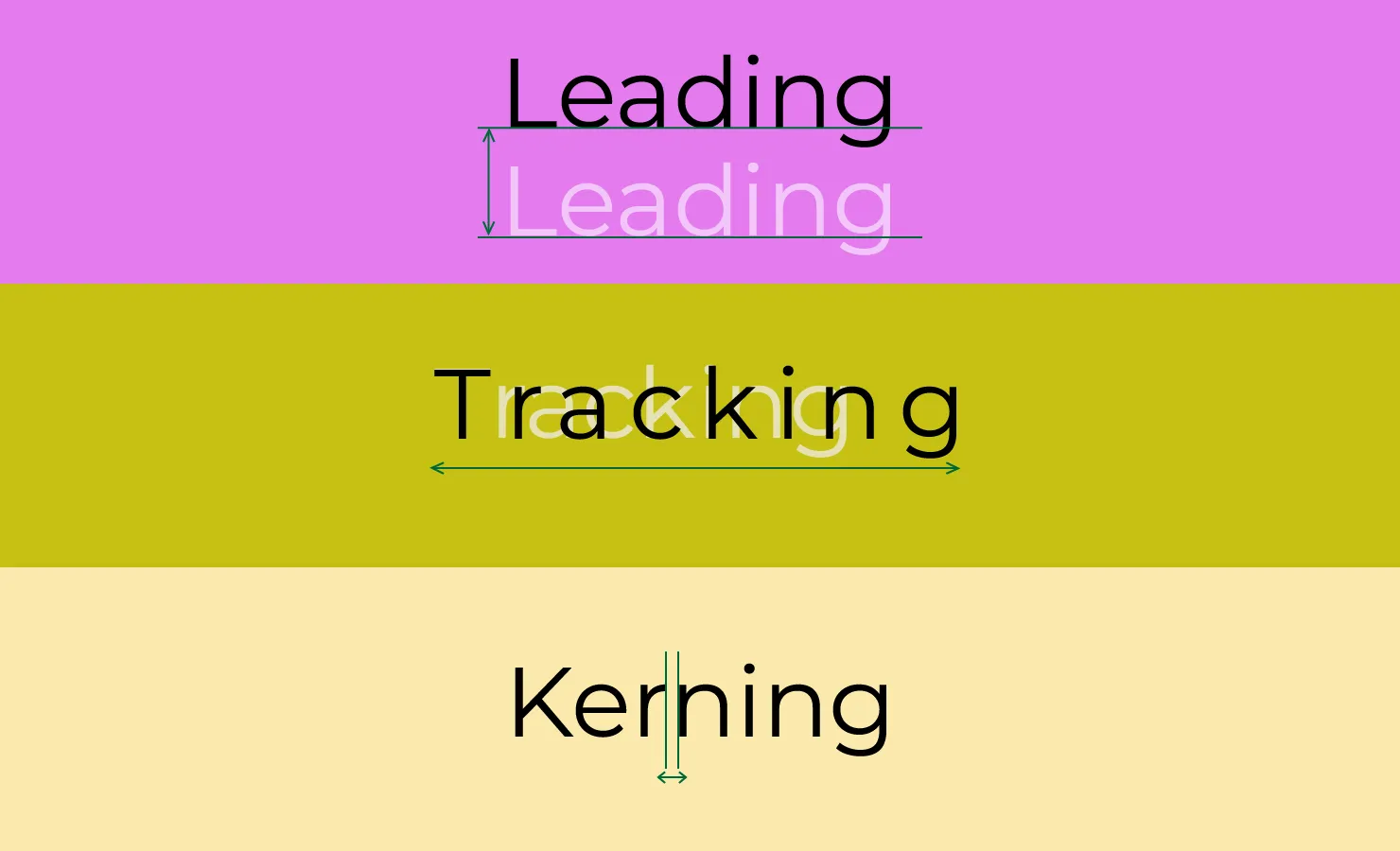
- Leading (Line height): The space between lines of text. Too tight makes it hard to read, too loose makes the text disjointed. For body text, a line-height of 1.5 to 1.75 times the font size is typically ideal.
- Tracking (letter spacing): The space between characters in a block of text, affecting the overall density of text. It’s better not to change this unless you know what you’re doing as it might create a bad reading experience.
- Kerning: The space between specific pairs of letters to make the text look more balanced (e.g., A and V in some fonts).